Digital Calendars Are Efficient. But Where's the Feeling?
LoopDeck is a photo-based layer for digital calendars that adds warmth and personality through a rotating stream of images. Inspired by physical keepsakes like postcards and polaroids, it lets users display a looping set of photos that change with mood or season. The transitions are subtle, so the calendar stays functional while feeling more personal, expressive, and emotionally engaging.
🤫 Live Demo is still kept as a secret

A Calendar Banner That Sparks Joy
Create a banner that sits above a personal calendar interface, customizable, uplifting, and human.

A rough sketch exploring how physical calendar design elements can be reimagined in a digital format.
The need to reframe the problem.
Early feedback from peers helped uncover a deeper need. People didn't want just a static photo. They want moments. Emotions. A way to feel something when they open their schedule.
One of my peers said:
“I want to open my calendar and feel like it’s my personal space. Not just a schedule. Like I’m decorating it with memories, not just planning for the future.”
That insight helped reframe the project’s goal.
Instead of asking, "How can we make calendars prettier?"
I began asking:
What if the calendar could become a safe, familiar space. One that reflects your past, your joys, your seasons, and not just upcoming tasks?
Design Concept: Loopdeck, a Living Photo Banner
Loopdeck is a dynamic banner that loops through an album of photos chosen by the user, images that reflect the mood, mindset, or vision they have for the month.

To avoid misinterpreting the visual change as a calendar flip, images dissolve rather than slide. Maintaining a calm, continuous rhythm.
Mix, Match, Loop!
Users can pick and organize their Loopdeck images in any order they like, creating a flow that matches the memories they want to relive or the vibe they want to set for the month.

A drag-and-drop editing screen that lets users customize their Loopdeck’s sequence for a more personal and dynamic experience.
Users can also easily switch between LoopDecks that they have created beforehand, enabling faster context shifts and more flexible visual personalisation throughout the year.
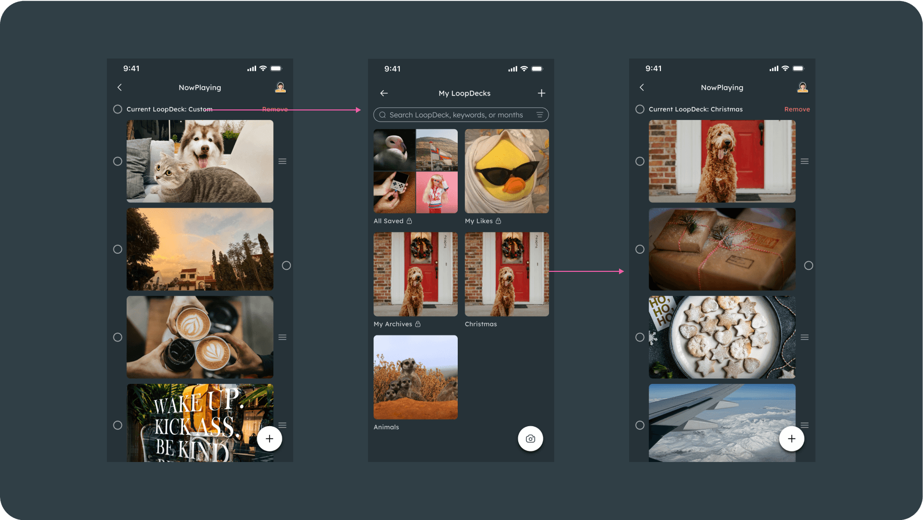
Tap the theme label to quickly switch between saved LoopDecks, enabling seamless changes in mood or context.
Maintaining User Context Through Motion
Because the two pages serve very different purposes: one focused on productivity (the calendar), and the other centred around images and memories, I wanted to ensure users wouldn’t feel disoriented when transitioning between them. To maintain a sense of continuity and context, I introduced subtle micro-animations during page transitions.

The currently displayed image smoothly shrinks into the first image of the NowPlaying row, and expands back when returning.
Ultimately, LoopDeck reframes the calendar as a living interface where content, motion, and structure work as one system. Through a carefully designed loop of imagery and subtle transitions, it adds a layer of emotional context without compromising usability or clarity. The design priorities continuity and legibility, ensuring that motion enhances rather than distracts from planning.
By integrating visual rhythm directly into the calendar experience, LoopDeck introduces a new interaction model for time-based tools where personalisation is embedded in the interface itself. The result is a product that balances functional precision with expressive design, making everyday planning feel more intentional, cohesive, and human-centered.