How different is a design system for (non-liquid) glass UI?
Glassmorphism introduces constraints such as ensuring adequate contrast and readability, supporting light/dark theme detection, and managing performance. Since blur and transparency are resource-intensive, the effect should be used sparingly to avoid increased energy consumption on mobile devices.
🤫 Live Demo is still kept as a secret
Cards
Introduction
Glass UI relies on layered card components to create a sense of depth over the background. As a result, the background used are usually rich and realistic visuals. Which in this case, it is displaying dynamic weather scenes that is powered by a open source API, Weather API.
Therefore, it is important for the UIs to adapt dynamically to light and dark themes based on the background to maintain visual clarity, contrast, and accessibility.

Dark/Light Theme
This concept draws inspiration from the spatial interface of the Apple Vision Pro, where content is presented as floating, modular cards within the user’s environment.
The visual system adopts a dark-overlay background paired with high-contrast white typography to ensure strong readability and maintain focus across layered content.

image from icons8.com
The initial exploration focused on a single, unified theme to maintain visual consistency across the interface.

OR


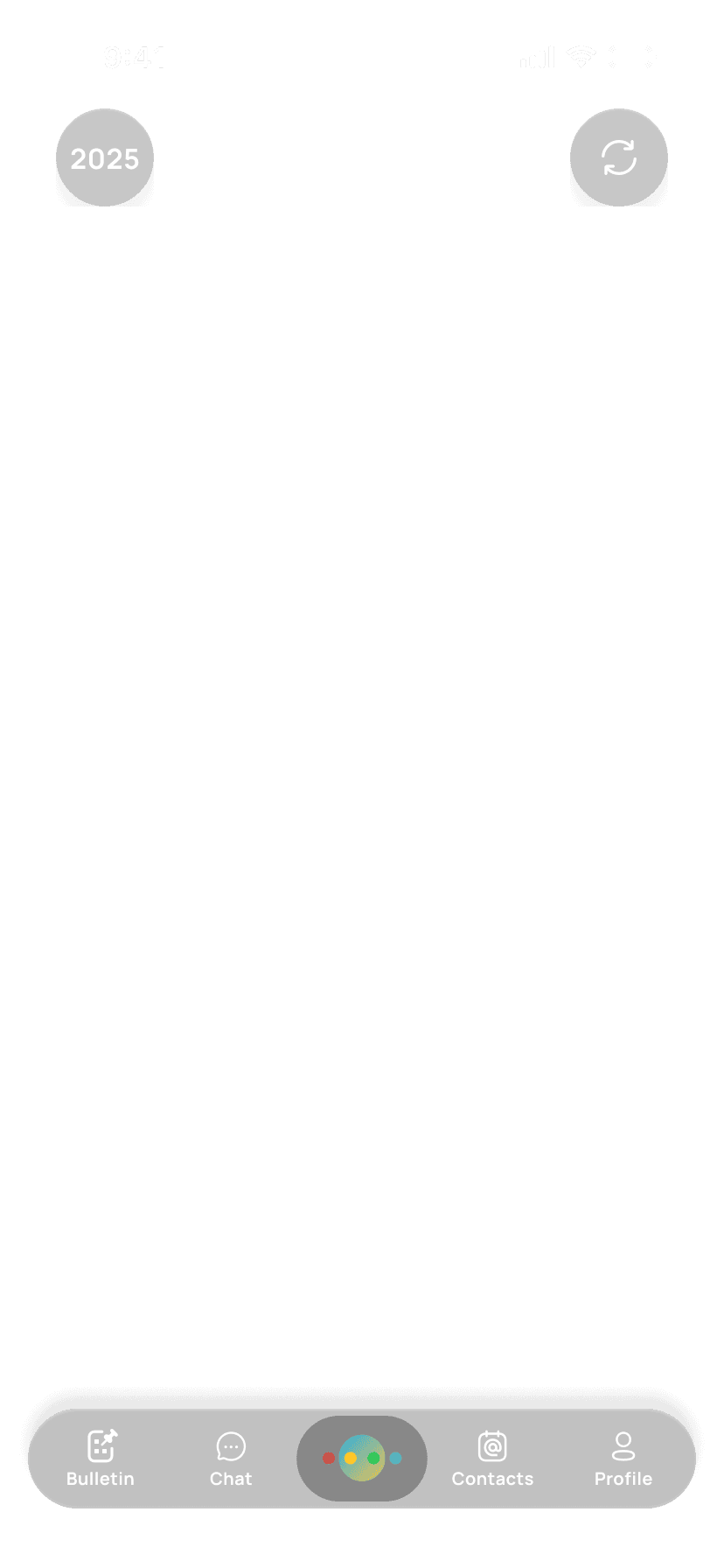
theme="dark"

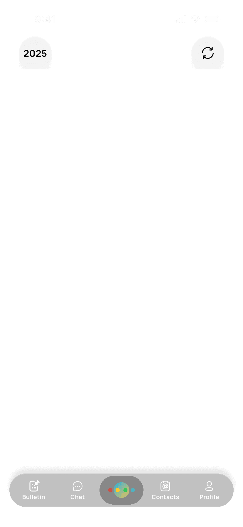
theme="light"
Switching to a fully light theme introduced contrast and readability issues.
The solution was a hybrid system: a dynamic theme that adapts to real-time background conditions from the API, balancing visual accuracy with consistent legibility.


Dark Mode (Token: Dark)
Uses a subtle, low-opacity dark overlay to create depth without overpowering the background. Text is set in white to maintain strong contrast and readability.
text-colour: var(--Text-Primary, #FFF);
card-background: var(--BG-Card, rgba(48, 48, 48, 0.30);
date-box: var(--BG-Surface, rgba(255, 255, 255, 0.10));
current-day: var(--Text-Primary, #FFF);
Light Mode (Token: Light)
Applies a stronger overlay to ensure sufficient contrast against brighter backgrounds. Text switches to black to preserve clarity and legibility.
text-colour: var(--Text-Primary, #000);
card-background: var(--BG-Card, rgba(48, 48, 48, 0.05));
date-box: var(--BG-Surface, rgba(255, 255, 255, 0.10));
current-day: var(--Text-Primary, #000);

Blur Control
Given the nature of the weathered background, blur effects should be used sparingly to ensure visibility. The goal is to preserve background visibility so users can still perceive the current weather context.

Fall Back Plan
A fallback design ensures the component remains accessible and reliable across varying backgrounds, devices, and performance constraints. This is triggered when the glass and blur effects may impact performance on certain devices.
Dark Mode (Token: Dark-Fallback)
Using a dark overall theme, with layered tones of grey to establish visual hierarchy. Cards use a deeper opaque shade, while elements like the navigation bar and floating buttons adopt a slightly lighter grey to maintain depth and separation.
text-colour: var(--Text-Primary, #FFF);
card-background: var(--BG-Card, rgba(48, 48, 48);
date-box: var(--BG-Surface, rgba(68, 68, 68));
navbar: var(--Text-Primary, rgba(82, 82, 82));
Light Mode (Token: Light-Fallback)
Using a light overall theme, with subtle variations in tone to create visual hierarchy. Cards use a soft, slightly elevated surface color, while elements like the navigation bar and floating buttons adopt a lighter shade to maintain depth and separation without relying on heavy contrast.
text-colour: var(--Text-Primary, #000);
card-background: var(--BG-Card, rgba(217, 227, 245));
date-box: var(--BG-Surface, rgba(236, 241, 250, 0.10));
navbar: var(--Text-Primary, rgba(246, 249, 255));

This work reinforced the importance of defining not just components, but the conditions under which they succeed or fail. By incorporating constraints, fallback strategies, and clear usage guidelines, the component becomes a reliable part of a scalable design system.